Web form usability is important because the more usable your form is the more likely it will be filled in by the user, helping meet your objectives for the form.
An important aspect of web form design is the display of the fields and how they appear against the background colour of the page.
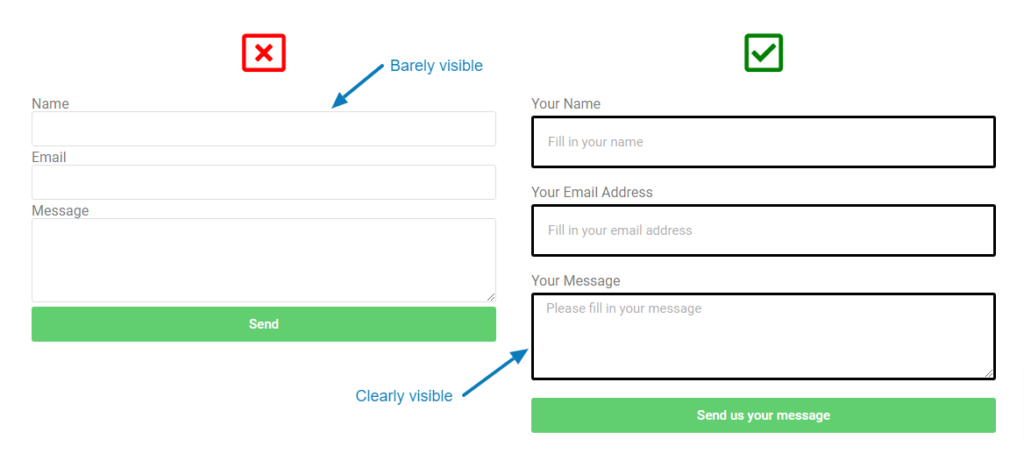
Providing an outline for form fields that helps to clearly mark where on the page they are helps the user to quickly click through to each field with their pointing device, like a mouse, or with their fingers if using a touch screen. This is especially necessary when the form field colour closely matches the background colour of the page e.g. a light grey field on a white page is almost impossible to see for many users.
When fields are not clear on a page it makes it difficult for those who suffer from visual disabilities to use your form e.g. 8% of men suffer from colour-blindness and 15% of all people over the age of 45 suffer from some form of reduced vision – outlining fields clearly helps to include all these people especially if they don’t use any form of corrective technology like spectacles.
Anxiety caused by poor design is almost never considered but people do become anxious when they are on an unfamiliar website and cannot use it easily and intuitively. By outlining form fields, you’re making it obvious where the fields are, reducing any anxiety the user may have when filling in the form.
In order to make your web forms accessible and inclusive for all your users be sure to instruct your web designer or marketing agency to add this very simple design pattern.