Does your website make proper use of colour and contrast? Colour and contrast are important in web design not only for the aesthetics but also for usability and accessibility.
Continuing the series on website accessibility, I focus on colour & contrast in this article and how they can affect your website visitors.
Colour makes the world a more exciting place, right? It adds interest, helps with definition of pictures, can be polarizing (is the dress blue or gold? Remember that going around a couple of years ago?), can affect our mood, can influence our decision-making etc. Colour is important, I think we can agree?
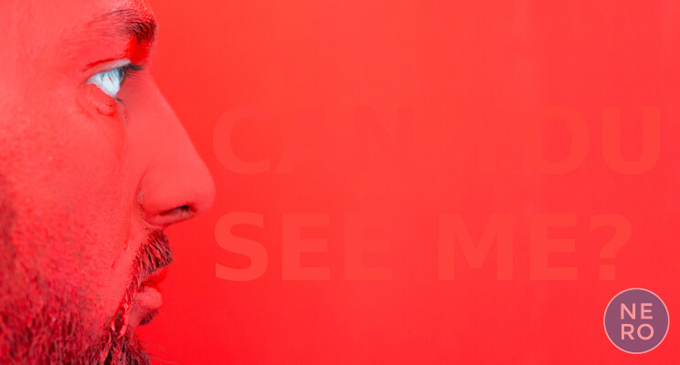
But what if what you’re looking at, be it a picture or text, is all one colour to you? You know for a fact that the image you’re looking at has more to it than you can make out; You know that the copy you’re trying to read on a web page has important meaning to you but you can’t make it out from the background. How frustrating must it be knowing you’re missing vital information and meaning on a website just because the colour of the image or text hasn’t been thought through carefully?
The Web Content Accessibility Guidelines (WCAG) recommendation is that at least important information, whether conveyed by image or text, have a sufficient contrast to the immediate background so that it is legible by website users who have moderately low vision. This helps those with any visual issues to understand the content of your website without necessarily having to use assistive technology.
Vision loss is a natural part of aging, but other issues like diabetes and obesity can contribute to earlier onset of sight loss. Both diabetes and obesity are on the rise in the UK meaning the numbers of people with sight problems in the UK are likely to increase dramatically over the next few years.
Contrast is especially important to those affected by colour blindness – shades of different colours can look similar and reduce contrast – and in Britain approx. 3.5 million people, about 4.5% of the population, are colour blind.
So when you’re next putting together a design for your website or web page, be sure to take into consideration how information on your site can be made more easily accessible to more people through the use of high(er) contrast colours. A well thought out design can be more accessible and still maintain an exciting aesthetic and an added bonus is that your website becomes more usable for everyone that visits it, leading to higher engagement.
Does your business website make proper use of colour and contrast?