“Error in your form submission. Please fix them and submit again.”
How often do you see this type of error message when filling out a website form? It’s usually placed either just above or just below the submit button, and provides no other information.
For example, which fields have errors? Particularly for large forms this kind of message is entirely useless – it puts the onus on the user to go through the form to try and identify where the mistakes are. Which fields have the mistakes? Sorry, can’t help you.
As I’ve covered in past user experience articles the aim of a web form is user engagement and the more obstacles the user faces in filling out a form, the lower will be the number of submissions, resulting in a lower rate of conversions.
So, let’s help our users to successfully fill in web forms, even when mistakes are made.
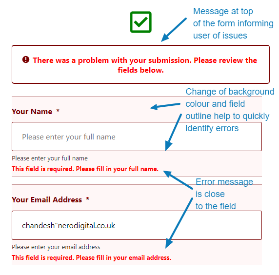
- Display a general notice above the form informing the user that there are issues with the form. Placing the notice above the form especially helps assistive technologies to reposition the user at the top of the form when there are errors and then run through the form from top-to-bottom, which is easier than bottom-to-top.
- To help quickly identify which fields have errors, it can be helpful to change the background colour of the area the field is in so the eye is drawn to the change.
- Likewise, changing the colour of the field outline helps the user to quickly identify fields with errors at a glance.
- Placing the error message near the field it’s for helps the user identify the field and what the error might be (the next tip will cover contextual messages).

Help your website users engage successfully with your brand by providing them with as much information in as intuitive a way as possible.
Would you like your website forms to convert better by taking into consideration your customer’s needs and expectations? We’d love to help – get in touch or book a discovery meeting today.


