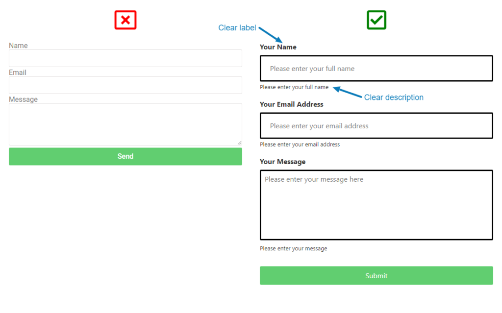
How often have you seen a website form where the fields don’t indicate what is needed from you? All too often I bet.
There’s a minimalist design pattern that designers employ to make a website form look sleek, by not including any text around the fields; no doubt the form looks good but is it usable?
After all, what is the point of the form? To look good or to encourage engagement with the user so a business objective is met? Clearly labelling all the fields on your web forms and providing useful descriptions reduces friction as the user is confident about what they need to provide in order to successfully fill in the form.

Now consider a visitor using a screen reader to navigate around your website and they come to the form with the intent to make an enquiry, register interest in tour service etc…
A screen reader reads out elements of the page to the user, but this becomes impossible if the form fields have no labels and descriptions leaving the user confused and very possibly frustrated – not exactly what you want your potential or existing customers to feel when engaging with your brand.
In another scenario, your website visitor may not fully understand what is being asked of them because English may not be their first language. Providing context via good descriptions makes the form more user-friendly for everyone.
So, help meet your business objectives and make filling in a form easier for ALL your users – pay attention to field labels and descriptions.
Need help making your website more accessible and user-friendly? As always, at NEROdigital we can help you. Get in touch or book a discovery meeting today.


